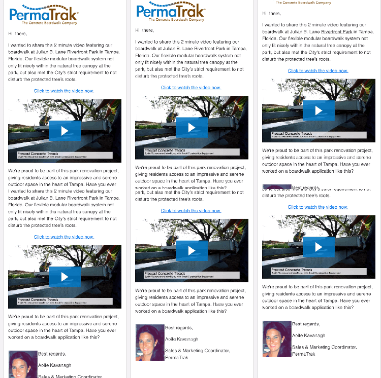
With our clients’ email newsletters, we’ve found that many times the responses aren’t “I’m ready to buy now!” - which is fine. Rather, many times the response is more along the lines of “Hey, thanks for the note - I’ve been meaning to discuss this potential opportunity with you.”
Targeted and personalized email newsletters can serve as powerful conversation starters, an effective way to stay engaged with your prospects and clients as your inbound marketing efforts take hold, and your contacts list grows.
Successful B2B Email Marketing
Here are six steps to take your email newsletters to the next level, with tips on how to be successful:
![]() Step 1: Start with a goal in mind. It’s always best to start with a goal for your email. It doesn’t matter if you’re sending the best content ever created; if your audience isn’t interested in it, it won’t get read. Think of questions like:
Step 1: Start with a goal in mind. It’s always best to start with a goal for your email. It doesn’t matter if you’re sending the best content ever created; if your audience isn’t interested in it, it won’t get read. Think of questions like:
- Who are you sending the email to?
- What is your message?
- When will it be read (in the morning, on the weekends, etc.)?
- Where are they going to read it (mobile or computer)?
- Why does your audience care about your message?
- How will you know if you’ve met your goal?
You must have a clear understanding of the primary goal for your email before you start putting your message together. Clicks and opens themselves aren’t a good goal; always keep in mind a specific action that your readers should take (more on how to get them to take that action later).
![]() Step 2: Optimize emails for opens. With a clear goal in mind, you want to create an email that will be opened, read, and successful in completing your designated action. The content of your email isn’t enough, though. Here are a few tips to grab your reader’s attention so they open your awesome email:
Step 2: Optimize emails for opens. With a clear goal in mind, you want to create an email that will be opened, read, and successful in completing your designated action. The content of your email isn’t enough, though. Here are a few tips to grab your reader’s attention so they open your awesome email:
- Keep your subject line short, straightforward, and to the point. Try to limit your subject to less than 60 characters long and front-load important works and phrases. Add personalization like the recipient’s name or company name if you can (and if it’s appropriate).
- Send your email from a company address, and never send them from “noreply@company.com.” If possible, use an address that helps readers understand the purpose of a send. For example, Best Buy uses the email handle “BestBuyInfo” for their promotional emails.
 If possible, send from a specific person who can reply directly. We like to send emails on behalf of our clients’ business development reps. They are very personal and invite the recipient to reply directly to start a back and forth email conversation.
- Don’t forget preview text! Preview text gives your readers a sneak peek of what your message is all about and is your first point of contact with your audience, so you want to be sure it’s compelling and irresistible to open.

 Step 3: Make your email look awesome on any mobile device! When composing your emails, always make sure that your message is compelling on any screen. We recommend these pointers to help you create the perfect mobile-friendly email:
- Keep scannability in mind. Most emails today are ready quickly, so you want to use bold fonts, bullet points, and concise messaging as much as possible.
- Use a font that is no smaller than 14 points.
- Make sure your email is laid out in a clear manner. Think vertically as much as possible so that your message is easy to read on a small screen.
- Preview your email for both browsers and mobile to make sure your audience will see your message exactly as you intended!
![]() Step 4: Compel your reader to action. Put your copy to work for you and compel your readers to action. Without a focus on your message, it will be hard for your readers to find it valuable. Here are a few tips to write effective email copy:
Step 4: Compel your reader to action. Put your copy to work for you and compel your readers to action. Without a focus on your message, it will be hard for your readers to find it valuable. Here are a few tips to write effective email copy:
- Use the right tone and personalize when you can. Make sure the voice of your email matches what your customers expect from their experience with you, and add personalization (like a reader’s name) if it’s appropriate.
- Proofread, proofread, proofread! Double and triple-check your email to make sure it’s free from spelling and grammatical errors.
![]() Step 5: Prevent formatting errors in your email. If you’ve ever noticed a formatting issue on an email after you’ve hit the send button, you know how deflating email errors can be. It feels like wearing a shirt to dinner with a big smudge on it. Take a few extra minutes before sending your email to prevent those awkward moments.
Step 5: Prevent formatting errors in your email. If you’ve ever noticed a formatting issue on an email after you’ve hit the send button, you know how deflating email errors can be. It feels like wearing a shirt to dinner with a big smudge on it. Take a few extra minutes before sending your email to prevent those awkward moments.
- Send yourself a test email before committing to the final version. View the test on your computer and your phone. Is everything easily readable and aligned correctly?
- Are all of your links working? Check the unsubscribe button as well. If your message isn’t resonating with someone, be sure they have the opportunity to walk away (this is also a legal requirement).
- Check your plain-text version. Is your email readable without images?
- If you can, test your email in different email apps, like Apple Mail, Outlook, and Gmail. You want to be sure everyone who receives your message has an equally awesome experience.
![]() Step 6: Take your reader to the next step. Of course you want everyone on your list to read your email, but the bigger goal of your message should be to get your reader to complete an action, like:
Step 6: Take your reader to the next step. Of course you want everyone on your list to read your email, but the bigger goal of your message should be to get your reader to complete an action, like:
- reading your latest blog article
- downloading your ebook, or
- placing an order
Use a call-to-action (CTA) button to take your reader to the next step. Below is an example of an effective CTA button:
Some other tips to encourage your readers to engage with your business:
- Add links to your images and copy so your readers will reach your offer or content no matter where they click or tap.
- Make sure that your readers easily understand what you want them them do - clear and engaging messaging is the goal here!
Craft Impact Insight
With billions of emails being sent everyday, it can be hard to break through the clutter. Try implementing some of these pointers on your next email newsletter campaign for better open rates, click rates and most importantly, engagement with your prospect or client base.

