You deserve a website that is more than just a brochure.
Think about the last time you looked at a brochure for a business. Perhaps it was tri-folded, and you had to open it up to review all the information.
Did it give you all the core facts about the business?
Yes.
Did it explain how things work when you become a customer?
Perhaps.
Did it add value and motivate you to reach out to the business for more information?
Probably not.
When your business website functions like a brochure, you are missing a key opportunity to attract, engage, and delight potential clients.
A better website attracts more prospects and generates higher quality leads by adding value to the lives of your visitors.
It should play a foundational role in your financial practice’s overall marketing strategy.
A better website will help get more clients, grow your practice and achieve your targeted goals.
As a financial advisor, it’s time to put your website to work for you and your practice. We’ve consolidated all of our knowledge gained from the industry into four core recommendations that will help you generate better leads with your website.
4 Key Website Recommendations to Generate More Leads for Financial Advisors
1. Optimize website with compelling messaging that is customer-centric, not-business focused
Open up your financial practice’s current website, and put yourself in the shoes of someone visiting for the very first time.
Are the words and phrases used on your website written with the visitor’s perspective in mind? Or is it articulated completely from the business’ point-of-view?
Is the messaging clear, consistent, persuasive, and emotionally action-focused? Does it draw me closer to performing some sort of action, or does it just provide information?
Does the website make me aware of a problem that I may have but don’t know it yet? If I already know my problem, does the website persuade me that the business is the best to solve that problem? Or do I feel compelled to navigate around without much of a purpose?
Our first recommendation has everything to do with the language and overall messaging on your website. Optimizing your website’s messaging is foundational in maximizing its usefulness as part of your business’ overall marketing strategy.
As a possible customer and potential client, I need the website to speak to me in a way that compels me to act - to want to learn more about the problem you are making me aware of, to actively seek out more information about how you are going to solve my problem, or to take advantage of content that is being offered by your business.
The messaging is what convinces me to continue to spend time learning about all that you have to offer.
2. Place Call to Action items (CTAs) strategically on every page
Every one of your website pages should be considered part of an overall strategy to get your visitors to take some action or move one step closer to building a relationship with your practice. Each page is an opportunity to pull them further along in their process of researching firms.
A “Call to Action” or “CTA” is an object (likely a button or image) that directs your visitor to take a desired action. This could be to schedule a consultation for more follow up information, to download a lead magnet (see #3 below) and access some sort of premium content, or subscribe to a monthly newsletter. These actions should not be random; rather, the process should be well defined and thought through based on your marketing strategy.
This is an example of a CTA at the bottom of one of our client's "retirement" focused blog articles.
These CTAs lead your visitors down a path that is aiming to convert them into a lead for your business. Many websites miss this step - and what they end up experiencing is thousands of visitors who come to the site, browse around, and then leave. Your financial practice has no idea they were even on the site. They’ve left to continue their research and visit your competitor’s site, without you even knowing it. CTAs lead them down a path where they will give you their information, in exchange for a lead magnet (see below).
This is a crucial step in turning your website from a brochure into a true marketing asset.
When thinking about your CTAs and the path you would like your visitors to follow, it’s important to consider the buyer’s journey. For our purposes, the buyer’s journey can be split up into three sequential “stages” or “steps.”
1. Awareness
2. Consideration
3. Decision-Making

Awareness
During the awareness stage, your potential buyers are experiencing a problem or some symptom of a problem. They may be starting to research more information about the problem they are experiencing.
In this stage, your prospects may be experiencing a new life event that makes them worried about their financial future, or they may have noticed they have money and investments spread out in a multitude of places (like multiple retirement accounts)
Your website should provide potential clients in this first stage of “awareness” many opportunities to learn more about the problem and be offered solutions or answers. Blog articles can help you become a trusted and knowledgeable partner in the eyes of the visitor.
CTAs in this stage should seek to move the visitor towards a conversation to learn more, subscribe to a newsletter, or any other option which continues to establish your business as a leading authority on the topic.
Consideration
Buyers reach the consideration stage when they have clearly defined the problem, and they are actively researching ways to solve the problem.
Prospects in the consideration stage know they need help with their finances and understand that a plan may help. Your goal is to help nurture them to understand how your financial advisor practice will solve their problem.
For buyers in this stage, consider a lead magnet CTA, a premium downloadable content that gives the buyer a valuable tool to help them in their problem-solving process. Not only does the buyer feel good about a free piece of content and continue to build a positive rapport with you as an authority, you get the contact information for a high quality lead for your practice.
 This is the title page of a “Lead Magnet” content offer. Lead magnets should be attractive, compelling, and useful for visitors. Check out more about lead magnets in #3 below.
This is a person who has the problem you want to solve - it’s just a matter of pulling them to the final stage.
Decision
The decision-making stage is marked by a buyer having done the research and is actively trying to decide between a couple options to solve their problem. At this point, the potential client probably knows a great deal about your practice and what value you offer.
Your prospects know they need a financial advisor to help at this stage. They are just trying to decide between you and a different provider.
Consider putting together specific, customized content that can be offered to prospects in this particular decision-making stage. The added value could tip the scale in your practice’s favor.
Pro Tip:
Build a “Client Success Map” to help move prospects in the decision-stage over the finish line. A Client Success Map is a 1-page document for financial practices that outlines the client’s future journey and shows them how their problems will be solved in partnering with you.
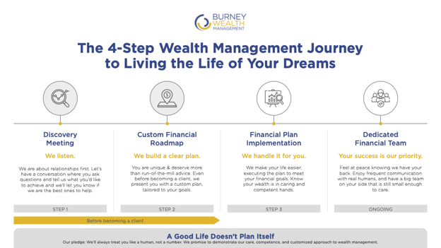 Here is an example of a client success map for the prospects of one of our clients.
3. Use lead magnets to offer value and attract the right prospects
A lead magnet was mentioned in #2 above. What exactly is a lead magnet, and what role does it play in generating leads for your practice?
A lead magnet is a purposeful, useful, and attractive piece of premium content that is offered to the visitor in exchange for contact information, usually an email address. It gives you a tool as a visitor to help solve a problem you are currently experiencing.
For the visitor, this is great. For just the price of sharing my email, I come away with a useful downloadable .pdf that I can “take with me” in my problem-solving journey. Talk about value.
For the company or practice, I now have a qualified, high-quality lead in that email address. Here is a prospect who has the problem I want to help solve, and I now am seen even more as an authority figure in that prospect’s ideas. Talk about value!
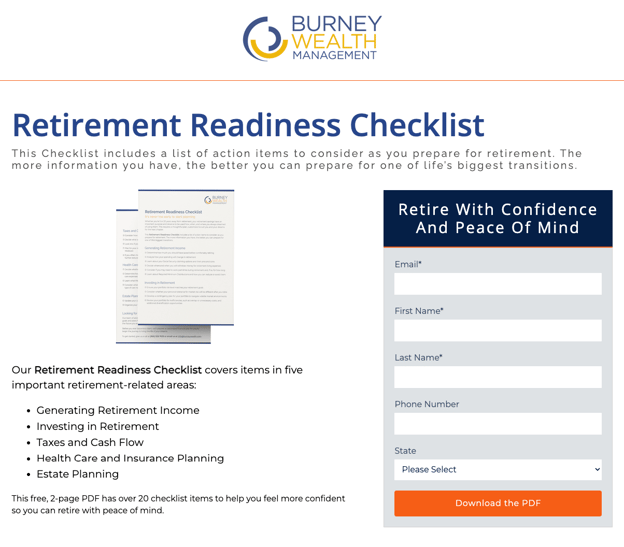 This is an example of a landing page that matches up with a “Lead Magnet” content offer. Notice how the visitor understands exactly what they will be receiving in putting in their contact information.
 This is an example of a “thank you” page. Once the visitor puts in their contact information, they can access the Lead Magnet Content Offer.
In addition to a downloadable piece of content, lead magnets can also be free invitations to virtual webinars or upcoming events you have planned. You can engage the prospects with particular topics that revolve around the major problem area.
Ideas for Financial Practice Lead Magnets
- Medicare 101 E-Book
- Life Planning Stages - What should I be thinking about? E-Book
- Financial Planning Checklist
- Retirement Planning Checklist
- Am I Ready for a Financial Advisor? Top Questions to Answer
- Financial Tool Technology Training Video
- Financial Questionnaire - Is this the right time? Audit and Report
4. Develop regular blog posts organized to offer value to visitors and improve search engine performance
Regular, well-written blog posts are essential to generating more leads for your practice.
Blog posts help establish a positive relationship between your practice and the visitor. The visitor gets value out of learning more about their potential problems and possibly reading through various solutions. The visitor sees you and your practice as an authority on the topic or issue.
Blog posts can be discovered outside of your main practice’s website and end up being the start of the pathway to learn more about you as a practice. The visitor finds your blog post, likes what is written, and ends up navigating back to your practice’s main website.
Over time, “clusters” of blog posts organized around specific topic areas will improve your practice’s overall search engine performance. Google learns more about your site by its organization, and it can only designate your practice as an authority on various topic areas if there is evidence of this authority. Blog posts which regularly offer value to visitors helps Google understand the overall architecture of your site, and as a result, your practice’s sites will appear higher in search results.
Next Step: Assess Your Website
It’s time to apply these recommendations to your financial practice’s current website and assess where things stand.
- Is the messaging on your website compelling and written directly to your top prospects?
- Do you direct your visitors to the best next step on each one of your website pages?
- Do you have purposeful and meaningful lead magnets to offer your visitors true value while creating a highly qualified lead at the same time?
- Are your blog posts well organized as cluster groups around a particular topic, and do they expertly and knowledgeably address the problems your practice is trying to solve?
- Does your website provide the best possible experience for your prospects?
Depending on the answers to these questions, it may be worth reaching out for a free Craft Impact consultation.
We work specifically with financial practices to drive growth by leveraging digital marketing strategies. We are looking forward to speaking with you!


